Using Machine Learning to Group US States by Covid-19 Hospitalization Trends
In this article I'll use a clustering algorithm to group US states based on trends in Covid-19 hospitalizations and other metrics. These results may hint at patterns of interstate travel during the pandemic.

Overview
Machine learning algorithms can provide unique insights from Covid-19 data. In this article I'll use a clustering algorithm to group US states based on trends in Covid-19 hospitalizations and other metrics. Some groupings are surprising and invite further investigation. Why would a state have a different trend than its neighbors? Why would some distant states have similar trends? These results may hint at patterns of interstate travel during the pandemic.
First we'll explore the hospitalization trend groupings, then we'll add more metrics involving cases and deaths. Lastly, we'll dive into how the project works.
Data Preprocessing
All data was scaled from 0-1 to account for population differences. We are looking at similar hospitalization trends and timing, not similar numbers hospitalized. Without scaling the groups are predictable and uninteresting: states with similar populations are grouped.


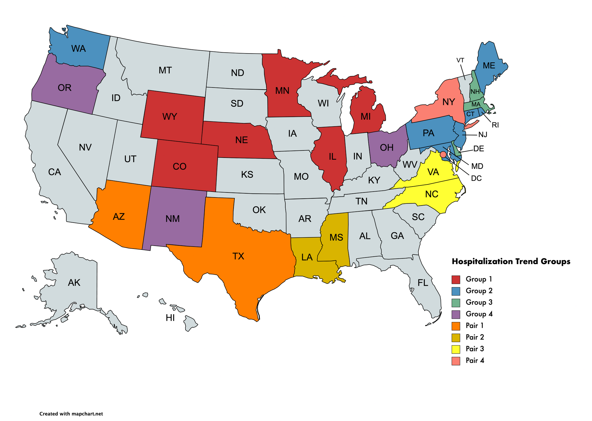
Results
The OPTICS clustering algorithm produced these groupings. The inputs were Covid-19 hospitalizations from March 2020 to March 2021 for each state.
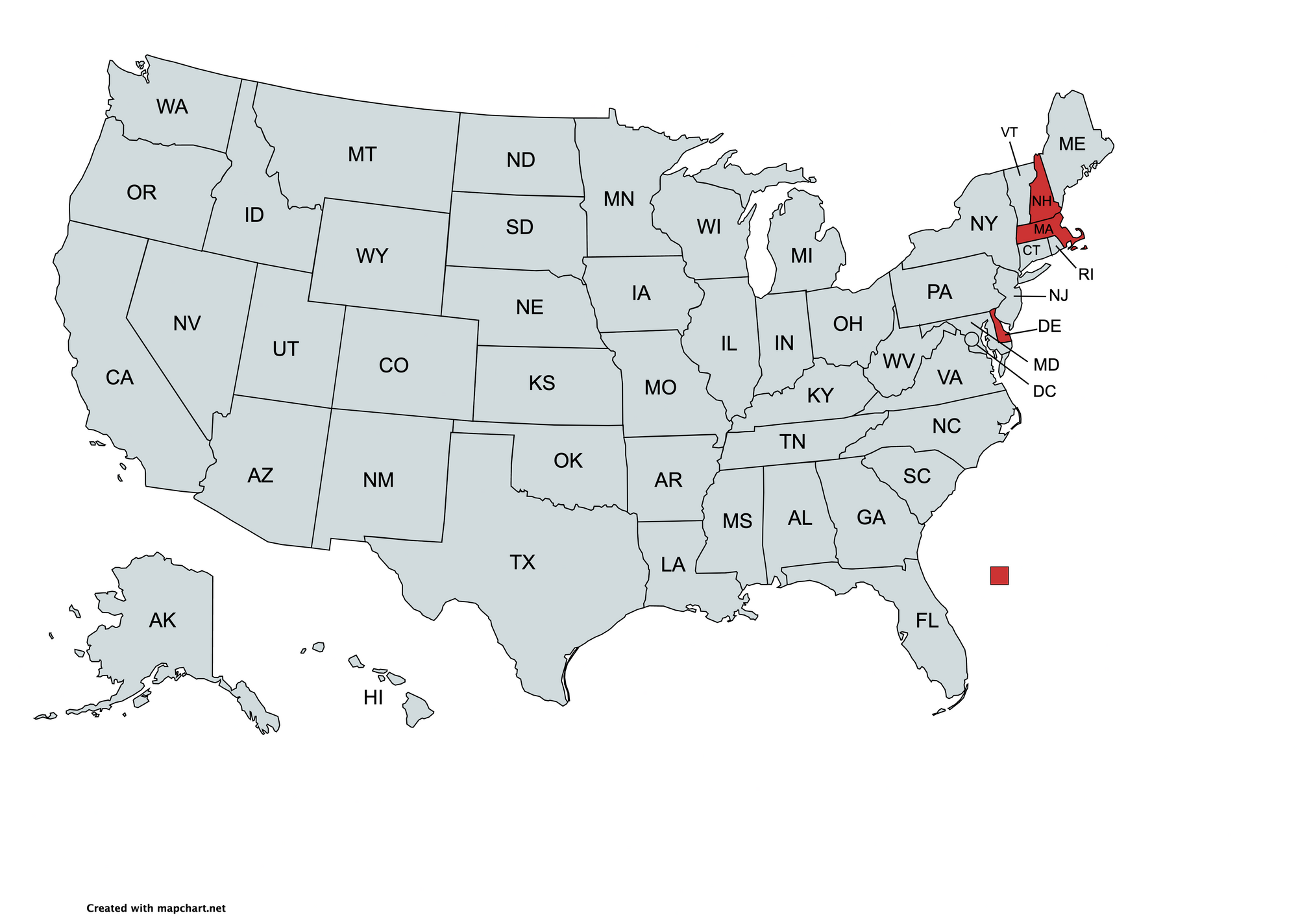
Group 1
Hospitalizations in these states followed nearly identical trends and peaked within 15 days of each other. This group has 3 bordering states.

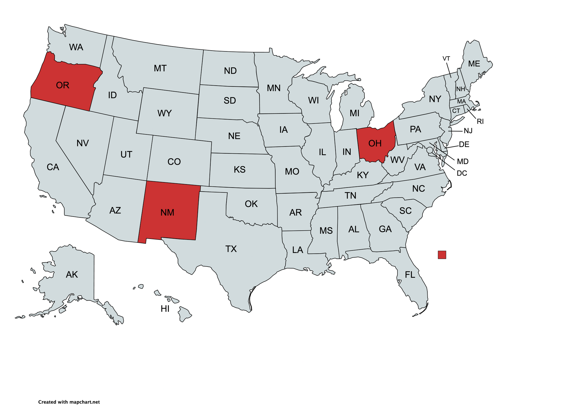
Group 2
The geographical outlier is Washington State. Despite this, the hospitalization trajectories show a similar plateau in hospitalizations around the same time.

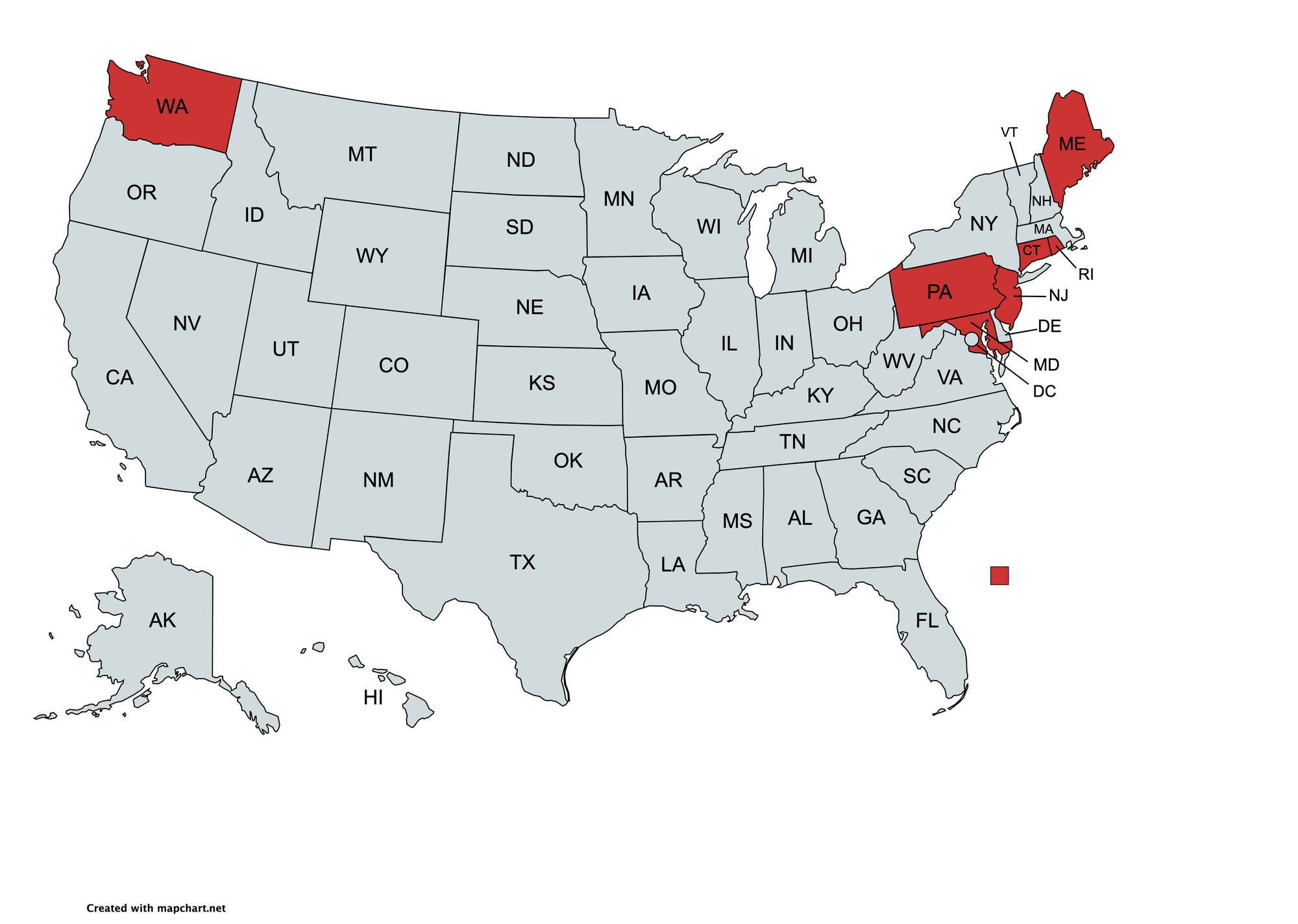
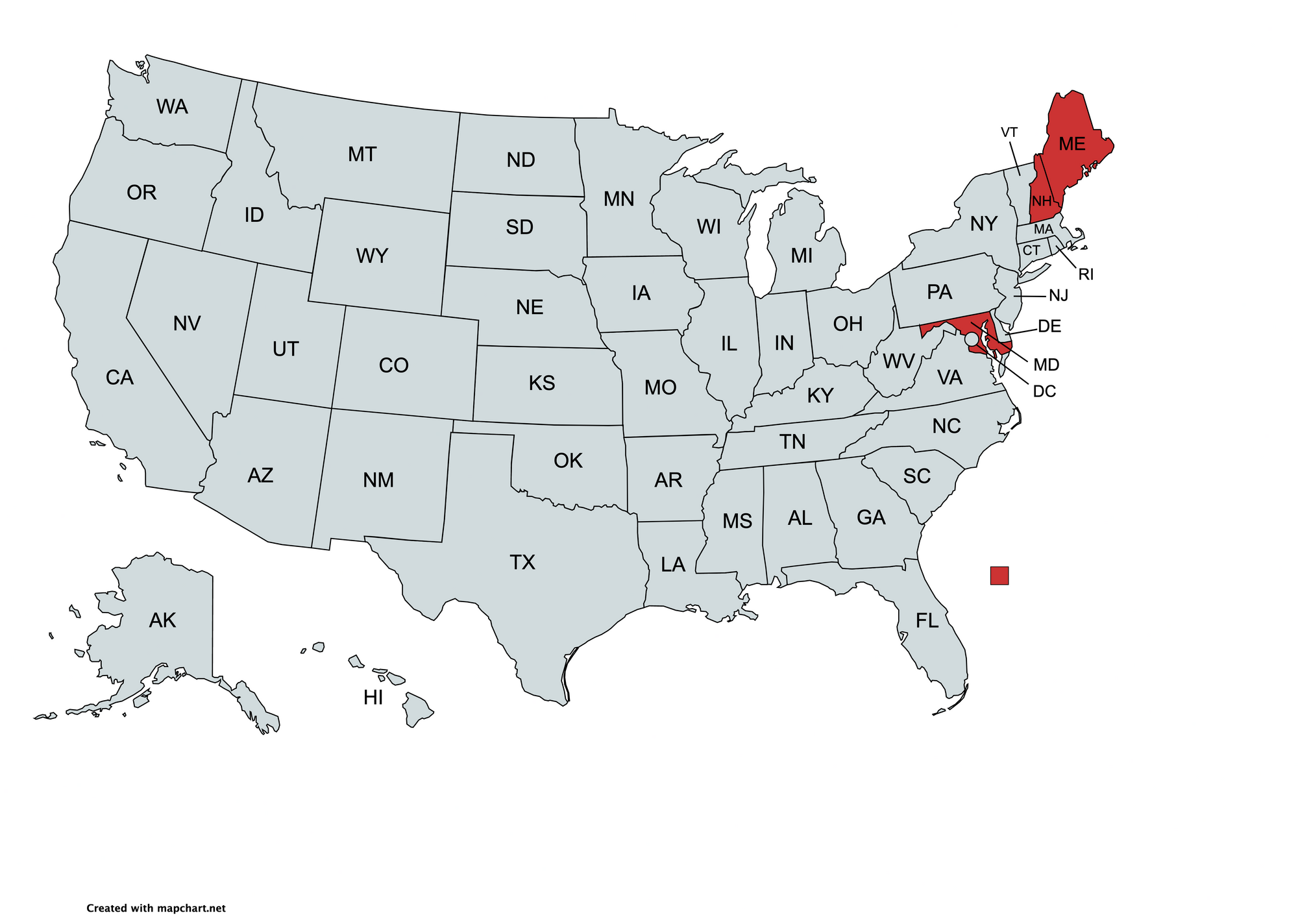
Group 3
Despite sharing borders with the last group, the clustering algorithm separates Delaware, Massachusetts, and New Hampshire. These states show a narrower and later peak in hospitalizations compared to their neighbors in group 2. Delaware is particularly interesting - it's completely surrounded by states from group 2 but does not share their hospitalization curve.

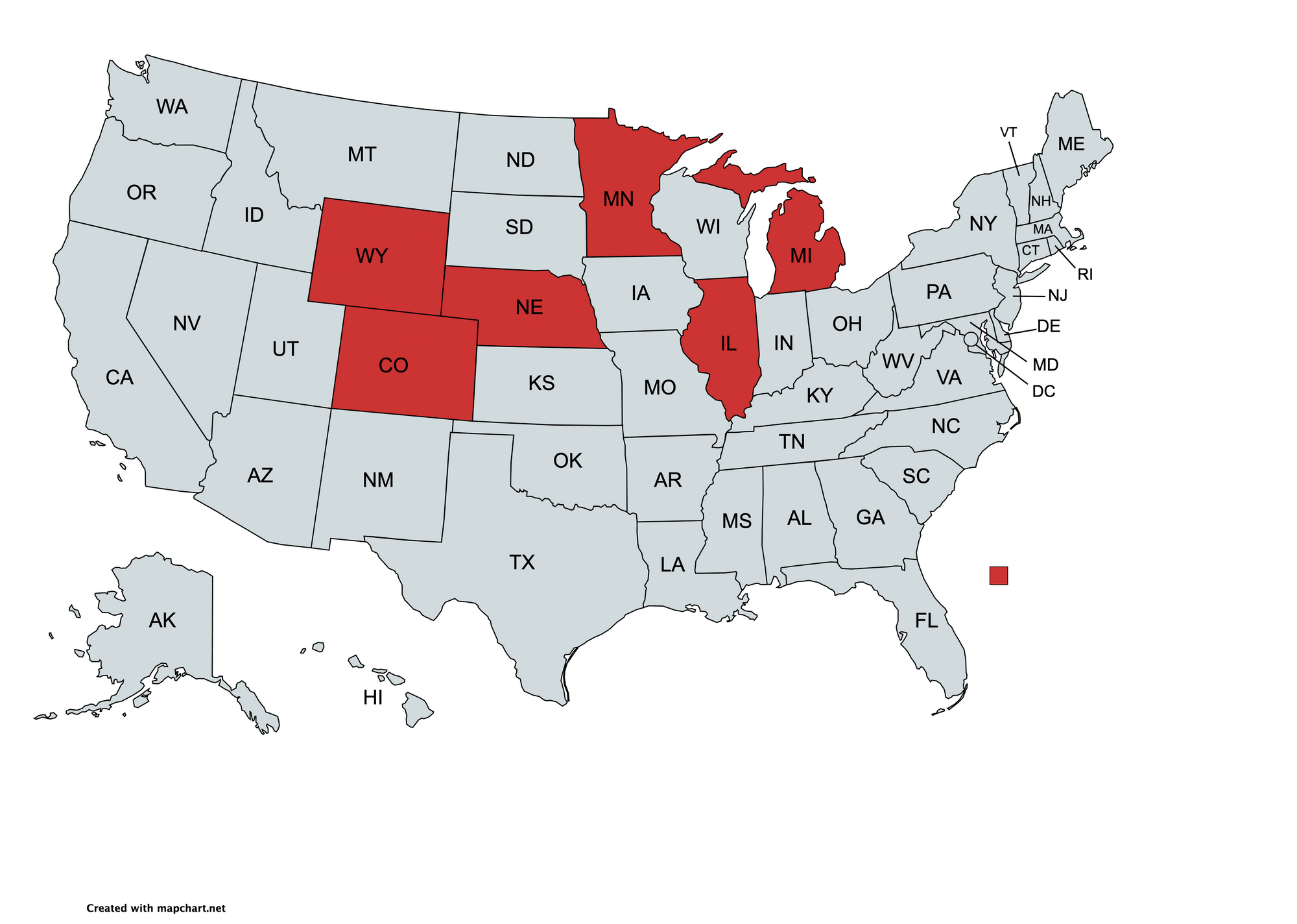
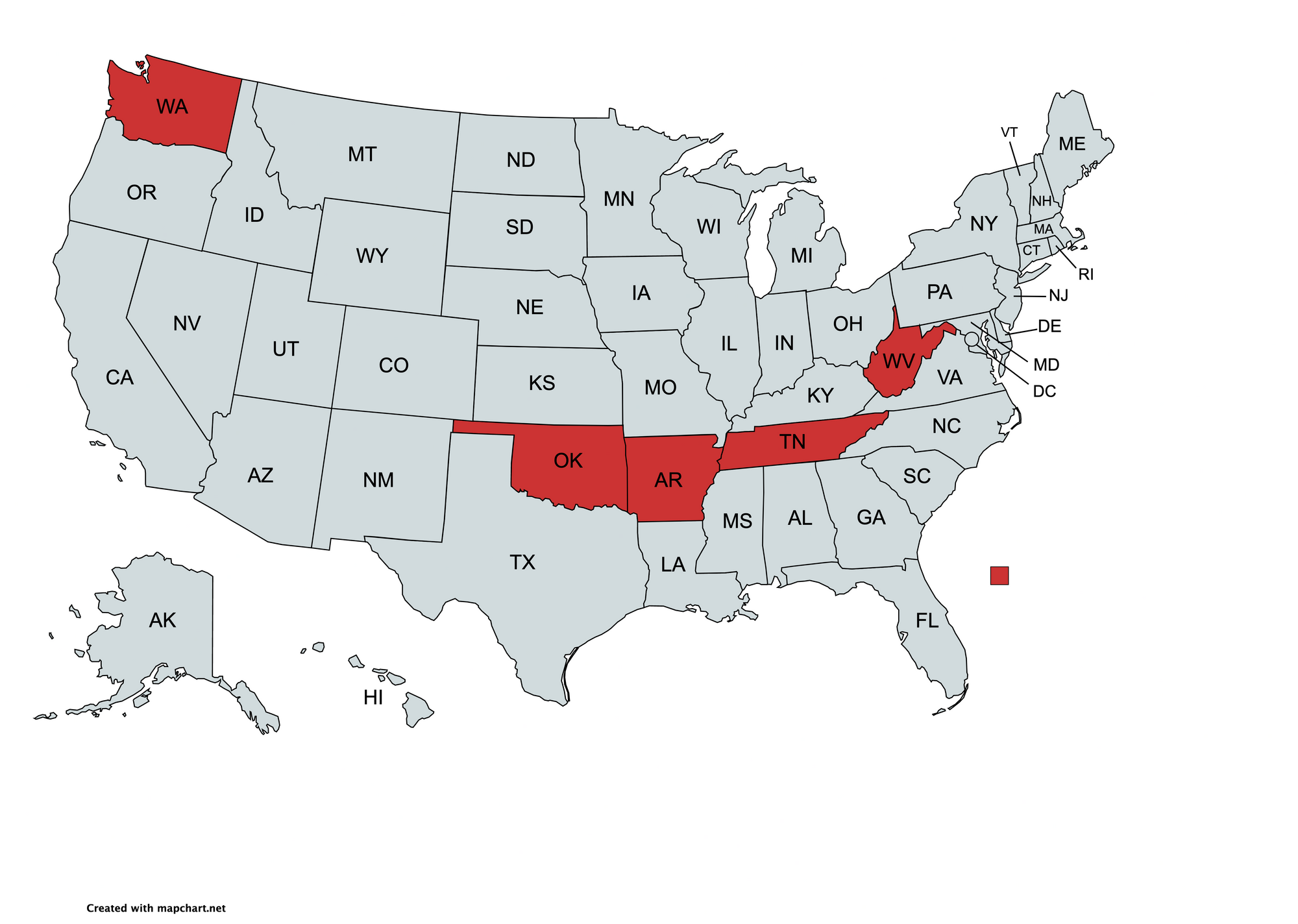
Group 4
These hospitalization trends are similar but the states are distant. Their peaks occurred within ten days of each other and have similar shapes. There may be a non-obvious commonality that led to similar trends.

Additional Hospitalization Groups
Lowering the minimum states per group from 3 to 2 results in additional groups. Note that AZ, TX, LA, and MS experienced two large peaks in hospitalizations, while DC, NY, NC, and VA experienced just one large peak simultaneously.
Two Peaks


One Peak


All Hospitalization Trend Groups
Adding Cases, Deaths, and Other Metrics
Using my web interface, we'll now add four additional metrics to cluster states by. Precise definitions for these metrics are found in the methods section.
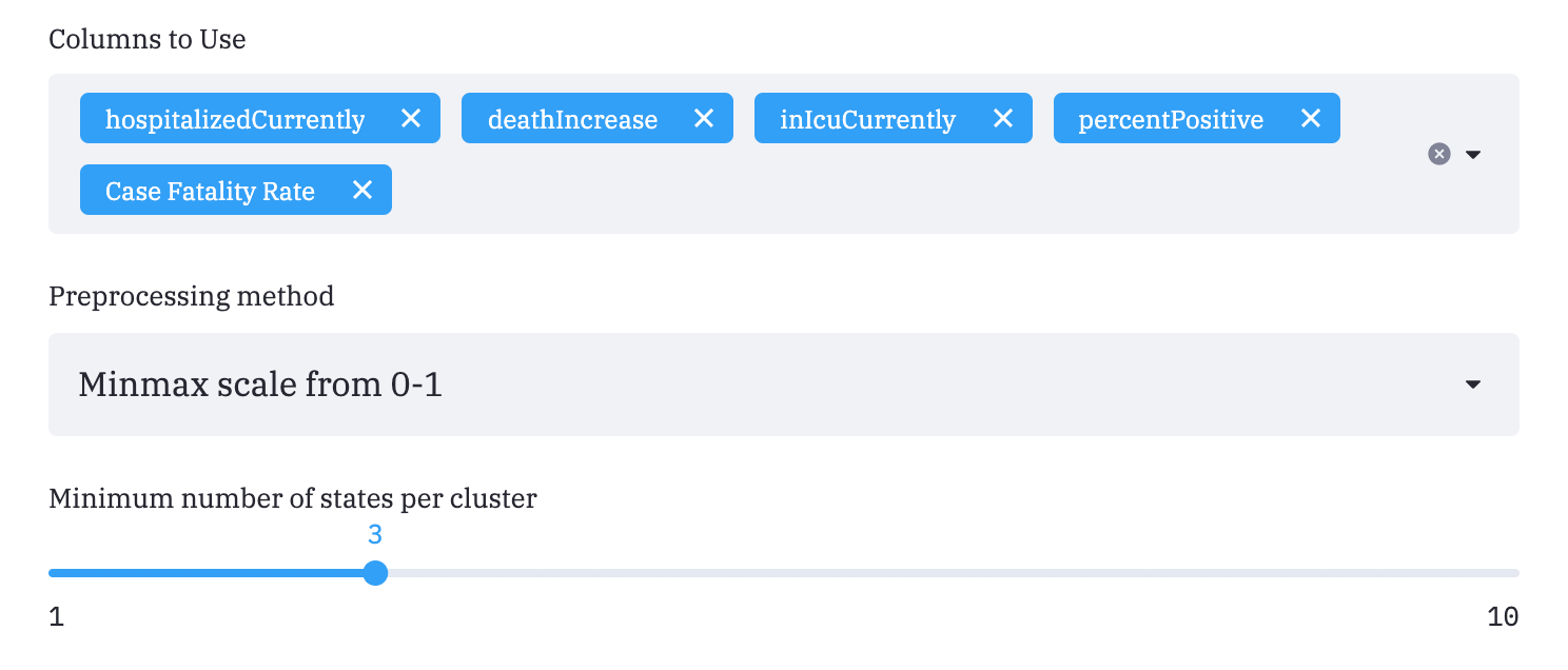
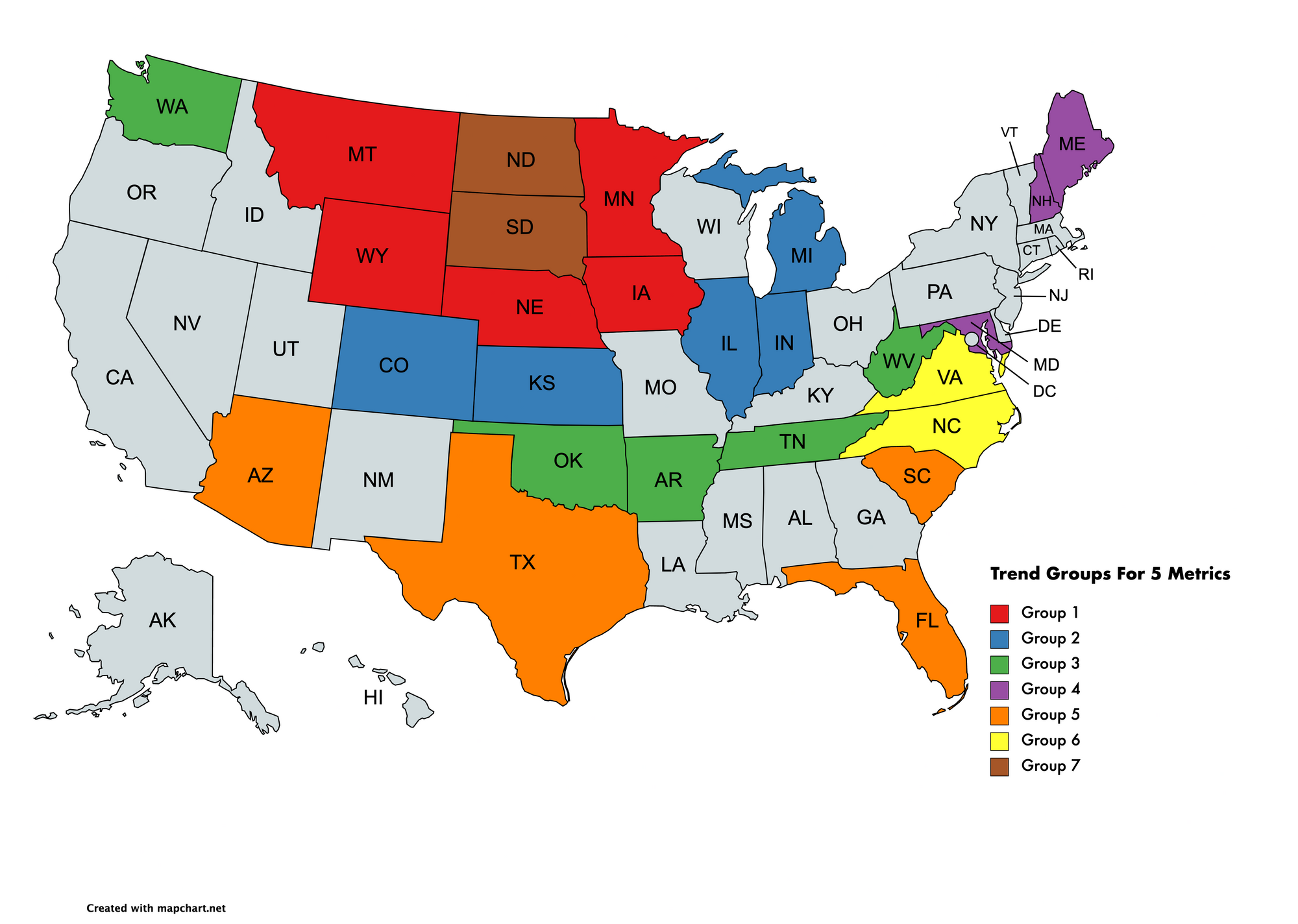
The clustering algorithm returns new groups after taking into account the five metrics above.
The line charts now attempt to represent all five metrics in each line. This is done with dimensionality reduction (more details later).
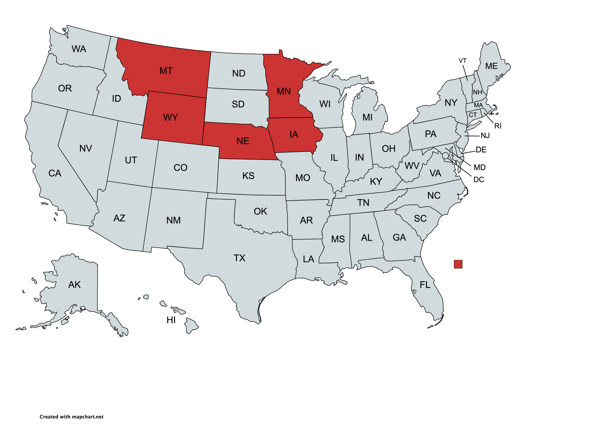
Group 1
The absence of the Dakotas is notable.

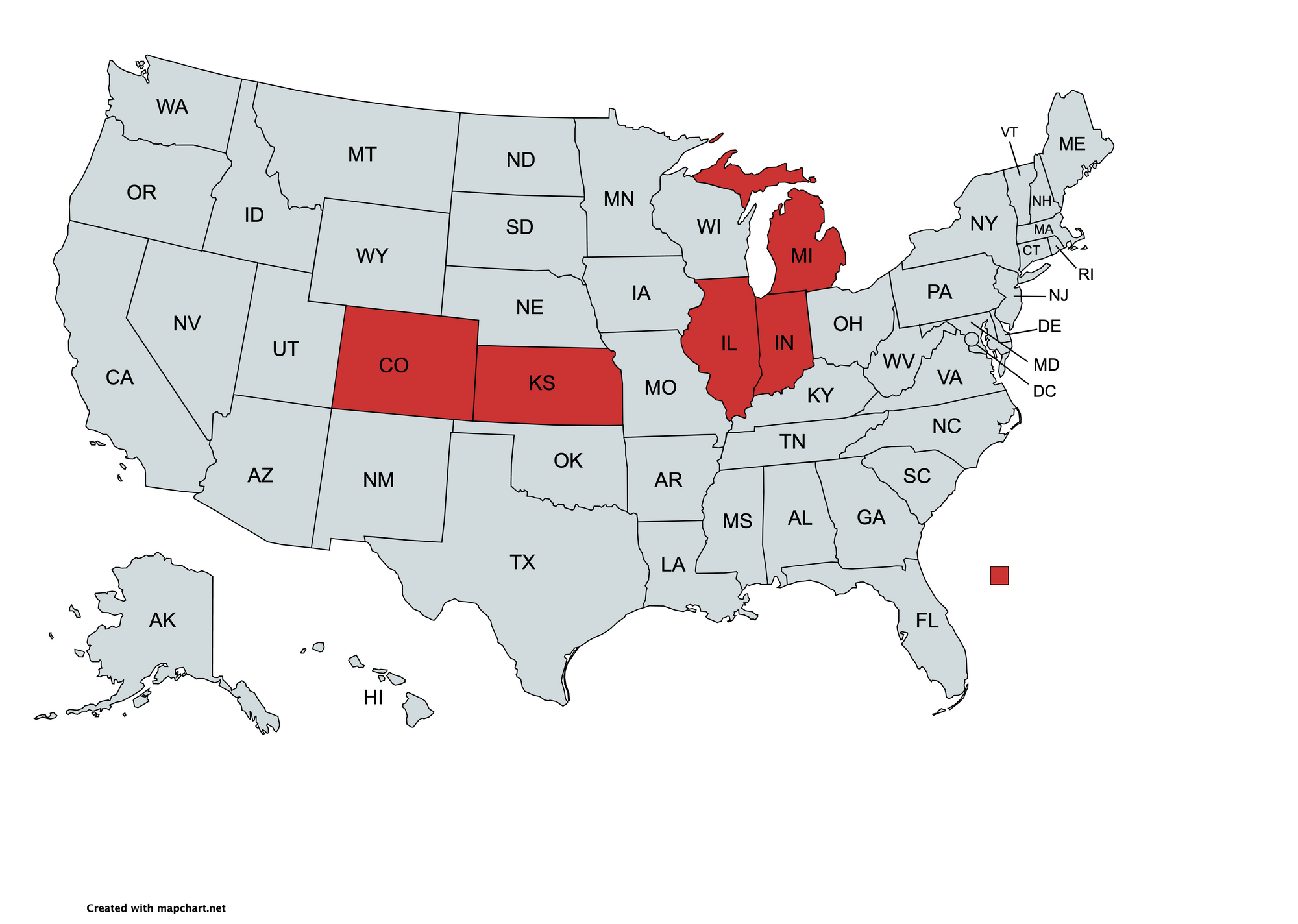
Group 2

Group 3
We again see Washington as a geographical outlier even though its chart shows similar trends in the five metrics.

Group 4

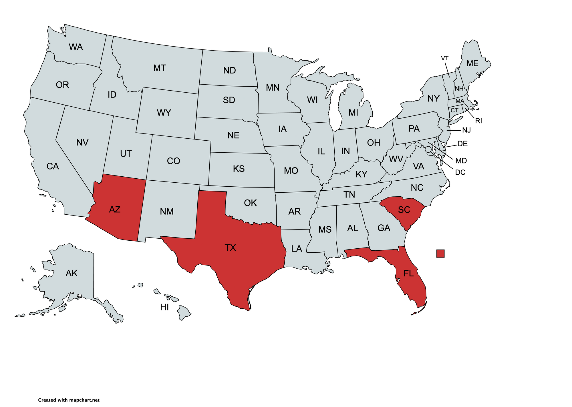
Group 5
These southern states show similar trajectories in the five metrics. They have two major peaks while the previous groups had just one.

All Trend Groups
Additional groups 6 and 7 were created by lowering the minimum states per group from 3 to 2.
Discussion
I'm a data scientist, not an infectious disease expert, but I'll speculate that interstate travel, population density, and related elements may be key factors for these groups.
For example, we can presume that there was more interstate travel between North and South Dakota than between South Dakota and any of group 1 (red in the above map). Other groups like group 3 (green) are less explainable due to geographical outliers.
Methods
All data is from covidtracking.com. The data was scaled from 0-1 as explained earlier.
Data Definitions:
hospitalizedCurrently: Number hospitalized for Covid-19 at any point in time. Not just new admissions.
deathIncrease: New Covid-19 deaths per day. This is smoothed with a one-week average as is common in prominent publications such as the New York Times.
inIcuCurrently: Number in an ICU for Covid-19 at any point in time. Not just new admissions.
percentPostive: The fraction of tests that are positive. I believe this is a better comparison than cases per million because of varying case definitions and testing rates between states.
Case Fatality Rate: Fraction of deaths out of known cases for each state. This is not the lethality of Covid-19, which is instead estimated by the infection fatality rate (IFR).
Reducing Dimensions
If more than one metric is selected then dimensionality reduction is done with PCA. PCA projects the metrics into a lower-dimensional space while attempting to preserve the information that explains the most variance. A potential improvement would involve clustering in all five dimensions and reducing dimensions only for visualization. I implemented a T-SNE function for this purpose.
The OPTICS clustering algorithm was used to generate clusters. The minimum number of datapoints per cluster was 3 unless otherwise stated.